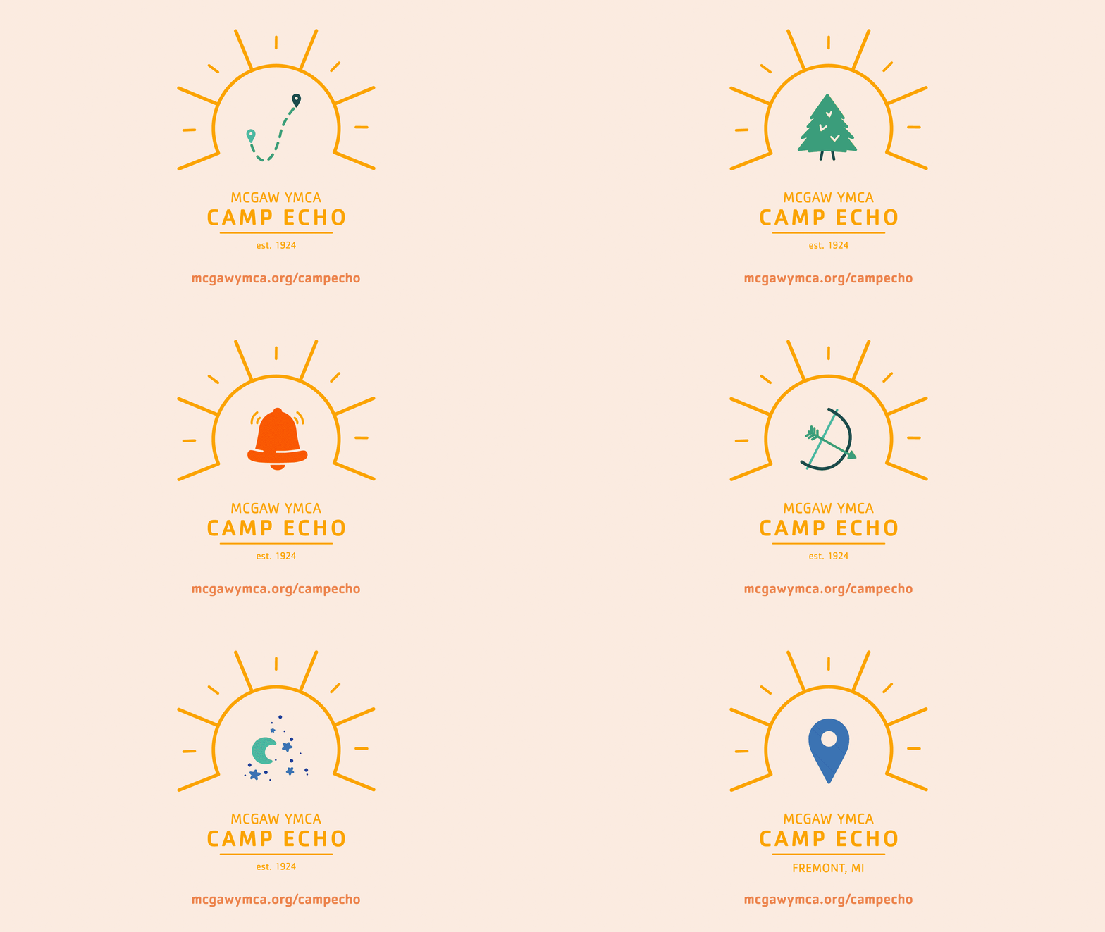
Camp Echo Branding
Branding
Illustration
McGaw YMCA
OVERVIEW /
Camp Echo, McGaw YMCA’s residential camp in Fremont, Michigan, needed a refreshed identity that aligned with the YMCA’s brand guidelines while maintaining its unique heritage. Tasked with this rebrand, I developed a visual system that honored the camp’s history while creating a more meaningful and flexible design.
Inspired by the YMCA’s core values, I used the triangle—a long-standing symbol of spirit, mind, and body—as the foundation. I designed a series of versatile icons that can be used individually or together in dynamic compositions. Anchoring them with a sun reinforces the essence of summer camp, while the circular form represents community, globality, and togetherness. This adaptable system allows Camp Echo to evolve over time while staying true to its identity and the experiences it fosters.
ROLES /
Creative Director
Graphic Designer
Illustrator


